One app to remember it all.
Active Radar is a gear management app that helps users to keep track of their outdoor equipment.
Capstone Case Study_Bagera Zyara & BrainStation 2021Vancouver, BC.
About The Project
Description
Active Radar is an iOS app that lets you keep track of all your gear adventures. The app's simple interface allows you to create, share, and save lists of all the gear you would need in preparation for that next adventure. With Active Radar, you will never have trouble remembering your gear again.
Tools
Figma, InVision
Type of Project
From July 5th, 2021 to September 24th, 2021, I completed the BrainStation Diploma in UX Design. During my time at BrainStation, I spent 10 weeks working on a capstone project from start to finish. This case study shows the design process of creating my app Active Radar.
Platform
I decided to design an app native to the iPhone, due to its popularity. IOS is also what I am most comfortable with.
Roles
Lead Product Designer, UX Researcher, Information Architect, User Tester, Branding, UI Designer
Understanding
The capstone project is the culmination of all things I've learned in the program. It is my opportunity to demonstrate all the skills I have developed, by providing a solution to an actual problem faced by outdoor enthusiasts.
Understanding the problem space
The Problem
I have been going on a lot of outdoor adventures lately with my friends and I always leave some of my gear at home or forget to check the battery life before I leave. Sometimes I even bring the wrong equipment!
After coming back from those trips, I thought it would be cool to tackle this problem. After conducting some research, I have found out 72% of outdoor enthusiasts forget essential gear items during their adventures.(1)
So what if a mobile application would help you get ready for your outdoor adventures, by reducing the chance of forgetting something important. You could get more out of your trip!
Design Thinking
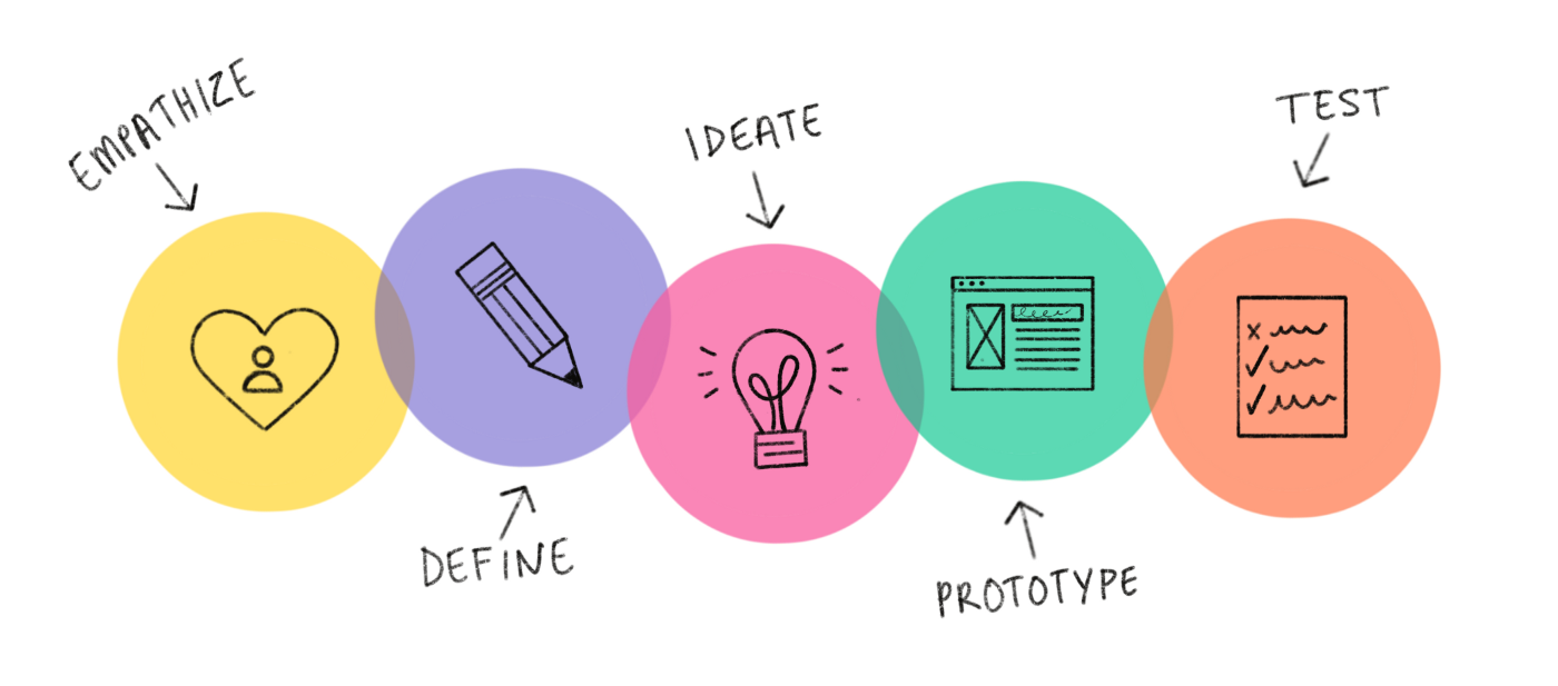
To create an experience that is fluid and human-centric, I started with the most fundamental part of the digital design thinking process: Empathies, Define, Ideate, Prototype & Test. This methodology provides a Human-centered solution-based approach to problem-solving.

Primary research
In order to fully understand the scope of this problem, I first identified the main challenges my potential users face. To do this, I interviewed six individuals about their past experiences related to forgetting important gear before their adventures.
After successfully conducting interviews, the results showed a common pattern amongst the interviewees. Being prepared for their adventures had the utmost priority. Additionally, users had an emotional attachment to their gear.
I found among my interviewees a common feeling of disappointment and displeasure arising from forgetting an essential item.
To begin honing in on the problem, I answered the following question:

How Might We
Help outdoor enthusiasts prepare for those exciting adventure trips by adding in peace of mind so they have all their essential items accounted for in real-time?
Secondary research
After the primary research stage, I wanted to learn more about the problem space. I wanted to collect data to help me understand users’ pain points and how to help them.
After analyzing the problem space, I reached out to my outdoor enthusiast friends, aged between 22 to 40. My main goal was to identify their pain points, emotions, and frustrations, as well as, current methods they utilized to prepare for their adventures, and, the digital solutions they hoped to see.
By studying the real behaviors of my users & checking similar apps, I found a market opportunity.
Persona
After all research stages are done, I created a persona to represent a certain class of users.
The creation, usage, and maintenance of the persona helped me add more empathy to my design process.
My primary persona comes from an athletic, health-conscious working-class family. She is interested in outdoor activities and fitness. She enjoys discovering new activities, both for training and pleasure.
Pain points: Not being able to remember all of her essential gear for her mountain bike rides.
Goals & Needs: An organizational solution so that she can maximize her time, and enjoy her adventures.
User Flow - Adding gear to a gear list
Task Flow - Search and add “flashlight” to the “Biking Adventure” gear list
Our selected task flow is for a user who wants to add items (flashlight) to a specific gear list (Biking Adventure).
1- User starts by selecting Biking Adventure from the preloaded list on the home screen
2- The gear list is empty so the user taps “Add new gear”
3- User searches for the correct gear by typing ”Flash” in the search bar
4- User is able to see all search results for the input “Flash”
5- User selects desired gear (flashlight) by tapping the checkmark box on the right-hand side
6- User is able to select multiple items if needed
7- When completed, the user can tap the “Done” CTA on the bottom of the screen to complete the process of adding the gear
8- The user then receives a confirmation pop-up showing that the item(s) has been added to her gear list.
User Stories
Now that our persona has taken shape, it would be beneficial to provide more insight into the users.
In order to identify which features would be required for my app, I created 34 user stories to imagine all the potential actions that my users might take to create epics. After narrowing down the epics and user stories, I was able to get my core epic.
Sketches
Wire Frame
Wire Frame
Usability Test
Usability Test
It all begins with an idea. Maybe you want to launch a business. Maybe you want to turn a
High Fidelity Prototype
Then, with the branding established, I designed my high Fidelity prototype. Check it out!
Usability Testing Summary
After finishing the third version of the wireframe, I had to create a prototype and put it into action. My main task was to create two rounds of usability tests to gather as much information and feedback.
In both of my usability tests, I assigned an evaluation task for each user.
Both users had to add a specific gear item to a specific list.
I really liked doing usability testing because I enjoy seeing the tester's reactions to something I created. Also, I highly recommend reading Chapter 9 of Don’t make me Think By Steve Krug (“Usability testing on 10 cents a day” ).
Small Recap!
Active radar is a gear management app that helps you keep track of your outdoor equipment such as skis and snowboards. it's designed to help users not forget any essential gear by providing lists with accurate real-time gear status. Active Radar will give users the power to connect and pair their electronic gear through Bluetooth and Wifi. This way they can keep track of electronic gear information such as battery status, and location.
Visual Identity
Brand
When the time came to build the visual language of my product, I carefully selected the words that express its “personality”. I wanted to portray a brand image that felt adventurous, useful, and reliable.
Feel
Before creating my High-Fidelity (Hi-Fi) prototype, I wanted the brand to convey the following adjectives: modern, minimal, sleek, slick, bold, efficient, reliable, tough, stylish, strong, well-built, precise, gentlemen, 007, mission, fast, well oiled, jet plane, a Swiss watch, detailed Swiss speedometer. The main reason I chose these adjectives is that I believe these to be all qualities that are necessary for an app that helps people with their thrilling adventures. I want the user to be able to easily find their custom gear lists for their adventures. I also wanted the brand to have an adventurous vibe to it, as well as an uplifting feel.
& Personality
I wanted to emphasize the product's personality. by portraying a brand feeling that would reflect what I imagined in my mind.
Accurate Than inaccurate
Dark Than Light
Modern Than out-date
Fast than slow
Accurate Than inaccurate
Energetic than lazy
mood board
-

Active Radar mood-board #1
-

Active Radar mood-board#2
user Interface Inspiration
-

Active Radar UI-board #1
-

Active Radar UI-board#2
UI - Inspiration
Here’s my UI inspiration board for Active Radar. I divided it into four main sections: typography, buttons, icons, and responsiveness. This allows me to be more creative and bounce ideas off the wall. After all, a picture is worth a thousand words!


Design System
UI

Marketing Website
Responsive Web app
To take it further, I designed a marketing website that acts as the first point of entry to the brand, which is a place where users are taken from paid ads. to generate interest and provide the context of the app, the marketing website’s goal is to highlight the app benefits and move users to take the primary desired action, which is downloading the app. I formed a responsive view when switching from desktop to mobile

Key Learnings
Value Your Users
People are complex and emotions can shape their decisions. It takes multiple iterations to encompass most democratic design solutions, like structuring gear information architecture by deciding what information to display first and where to place certain info
Embrace Ambiguity
With my Problem space, people don’t have a gear list app with gear life status. My app address a very real need-however, it was challenging to synthesize market research and primary interviews of user needs to create an app for a problem space that does not have a concrete solution yet.
Observe Behaviors
During user testing, I experimented with A/B testing different placements in my UI. I learned to observe people’s behaviors when they used my app. By using differing placements, I observed what a more natural flow felt like to them so I could know how to optimize their user experience better.


