Vancouver Stronger Together
A Digitial Solution that helps Vancouverites with all Covid-19 related issues.
Case Study Bagera Zyara & BrainStation 2021Vancouver, BC.
About The Project
Description
Vancouver Stronger Together is an iOS app that helps Vancouverites with all Covid-19 related issues.
Tools
Figma, InVision
Type of Project
Vancouver Stronger Together is a 6 - week case study project from BrainStarion’s UX Design Diploma course that spanned from July 2021 to September 2021
Roles
UX/UI Designer
Understanding the problem space
The Problem
Patients in Vancouver who want to get vaccinated must wait for extended periods of time in unfavorable locations or situations before seeing a healthcare practitioner. Most latest figures suggest a more than 68 percent rise in Visits to 2019, where the majority of the population performs worse in terms of wait time before initial evaluation and length of stay. Hospitals & clinics are overcrowded with patients and understaffed, increasing the of a patient experiencing a delay in treatment.
Design Thinking
To create an experience that is fluid and human-centric, I started with the most fundamental part of the digital design thinking process: Empathies, Define, Ideate, Prototype & Test. This methodology provides a Human-centered solution-based approach to problem-solving.
Project Goals
The main goal of my research is to learn more about vaccines for Covid-19 and the time gap between booking, waiting, and getting the shot. also, the time consumption affects Vancouveriest and the BC Health system. I hope I can reduce the frustrations of people who live in Vancouver with a mobile app that will solve & help users to book their vaccines shots based on location and availability and just to have more flexibility for the patient
Step 1: Empathize
Primary research
To completely understand this problem space, I conducted three interviews with three different users who have gotten vaccinated against COVID-19 In Vancouver, BC. July 2021. After the interviews, I was able to find similarities & common insights between the three interviewers and I was able to identify certain behaviors, motivation, and main core theme.
after analyzing all of the data and information from my interviews, I was able to come up with one Insights statement
To reduce the frustrations of patients by reducing their wait time to get fully vaccinated
To begin honing in on the problem, I answered the following question:

How Might We
Reduce patient’s waiting time before, between, and after their visit to clinic?
Secondary research
To refine my problem space and determine which demographics I would like to address, I conducted further Interviews and web research on the Issue of and found the following
younger People often have the easiest way to book appointments due to keeping up with coming App’s and Technology
Older People often have the hardest time to book appointments possibly due technology barriers
Step 2: Define
Persona
After all research stages are done, I created a persona to represent a certain class of users.
The creation, usage, and maintenance of the persona helped me add more empathy to my design process.
My primary persona comes from an athletic, health-conscious working-class family. She is interested in outdoor activities and fitness. She enjoys discovering new activities, both for training and pleasure.
Pain points: Not being able to remember all of her essential gear for her mountain bike rides.
Goals & Needs: An organizational solution so that she can maximize her time, and enjoy her adventures.
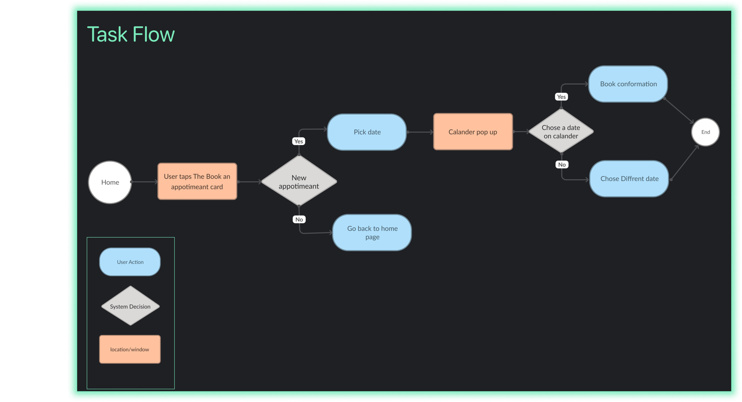
User Flow - Adding gear to a gear list
User Stories
Now that our persona has taken shape, it would be beneficial to provide more insight into the users.
In order to identify which features would be required for my app, I created 34 user stories to imagine all the potential actions that my users might take to create epics. After narrowing down the epics and user stories, I was able to get my core epic.
Sketches
WireFrame
WireFrame_V1
Wire Frame V2
WireFrame_V2
Usability Test
High Fidelity Prototype
Then, with the branding established, I designed my high Fidelity prototype. Check it out!
Usability Testing Summary
After finishing the third version of the wireframe, I had to create a prototype and put it into action. My main task was to create two rounds of usability tests to gather as much information and feedback.
In both of my usability tests, I assigned an evaluation task for each user.
Both users had to add a specific gear item to a specific list.
I really liked doing usability testing because I enjoy seeing the tester's reactions to something I created. Also, I highly recommend reading Chapter 9 of Don’t make me Think By Steve Krug (“Usability testing on 10 cents a day” ).


